Showing Empathy
I’ve been thinking a lot about the election. Yes I’m a liberal. Yes, I am a woman. Yes, I was displeased with the outcome. And yes, I voted for Hillary.
But what surprised me most was seeing liberal friends unable to control their emotional reactions to the outcome. For them watching someone who lacks empathy be elected president, opened up a flood of emotion that was hard to stop. There were tears for a week, even from some of the cool tempered people I know. The day after the election I teared up listening to Hillary's concession speech.
But for me after 2 days, my emotions dried up, replaced by a hard expression of familiar disappointment. People would bring it up and I would feel my jaw tighten and my lips disappear into a tight flat line. I wanted to share the sadness and frustration of my peers as they continued to get misty, I wanted to cry with them, feel outrage with them, and feel shocked with them. But that’s not possible for me.
As a person who was born during wartime in Central America, I learned early that peace and civility are actually an exception and not a rule in the world. That people have to choose empathy, and that they can also choose to turn away from it in times of fear. The knowledge that people can turn off empathy is something I have spent my life trying not to focus on. After all, I grew up in a better place, here in the states.
So now I wonder, where did the country's empathy go? Did I imagine it? Did we all? Is it still here? Can we bring it back? All these questions reminded me that sometimes it's the job of book designers to ask these questions visually. We often have to expose empathy or the lack thereof on book covers. And soon I was pulling together this post, a post on how designers show empathy or its absence. Do we yell it, whisper it, suppress it, fight for it, or assume it?
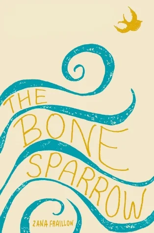
The Bone Sparrow
Jacket design and illustration by Maria Elias
My favorite option (because that’s my family’s story) is how we flee to find empathy. I’ll start there, with The Bone Sparrow. I designed this book jacket and I also love and identify with the novel. It’s the story of Subhi, a hopeful and naïve refugee born in an Australian detention camp. In the camp the refugees are mistreated, starved, and made to live in terrible conditions. His family fled war, but now find themselves in a camp that is no better than a prison. Subhi dreams of his missing father coming to him in a night sea, that only he can see. The design I created focuses on the dream of freedom, instead of the sadness of the camp. The sea on the jacket represents Subhi’s dream of escape to a place where he can find real empathy and peace.
Against Our Will
Cover Design by Georgia Morrissey
Can you yell for empathy? Can you demand it? In bold type? This book cover tries. With it’s big red and black type, and no art. It’s a protest sign, not just a cover. It screams for your attention and empathy. I read Against Our Will in high school. And it is NOT light reading. It is disturbing and eye-opening nonfiction text and something I think more women should be interested in reading. It’s a feminist classic. Georgia Morrissey designed this paperback edition. The book is about how women and men see rape. It explores the misconceptions that exist and contains interviews with men on the subject of rape. It’s eye opening and includes case studies from men’s POVs on rape. It is one of the first books that stressed that sexual assault is a crime of dominance, not lust. Rape is a crime that requires the loss of empathy for the victim.
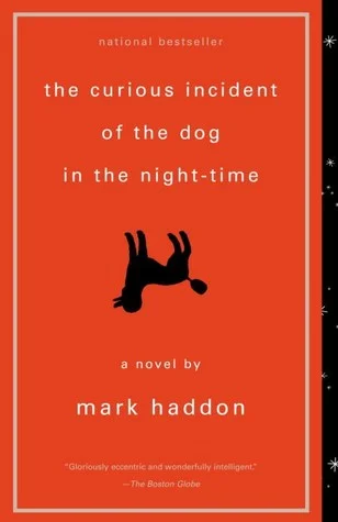
The Curious Incident of the Dog in the Night-time
Cover design by Michael Ian Kaye
Let's lighten the mood, here is a funny book cover that asks how do we empathize with an autistic boy who is unintentionally funny? The answer is quite clear for The Curious Case of the Dog in the Nighttime. Designer Michael Ian Kaye did it by taking the sadness out of the tragedy. He made death, the saddest thing you can think of, a fact instead.
The book’s narrator is an autistic 15-year-old, who when falsely accused of killing the neighbor's dog, must investigate the crime to clear himself. In an elegant and hilarious flip of an illustration, the designer takes a live dog, and makes him a dead dog instead. He shows us a funny and literal take of the plot. One that Christopher, the autistic narrator would approve of even though he would miss the humor.
The book and cover help you empathize with a boy who sees the world so differently people think he has no feelings. But you soon find that you can empathize with and root for this boy, even if he experiences the world from a strictly literal POV.
PS. You can see more of my favorite covers on my Book Design Heroines Pinterest collection. visit it here.


