Self-care & Intuition
What I remember most about my twenties is having so much energy I could barely get any sleep. Now in my thirties, I have managed to get it up to 6 hours a night. But back then four hours was an excellent accomplishment. And it wasn't just any kind of energy; it was a very specific manic creativity. My idea generator was stuck on full speed. I had new ideas constantly, and they were all variations and solutions for work. For example, 5 different ways to layout type would simultaneously build themselves in my brain. I’d sketch them to remember them all, because they'd disappear if I didn't focus on them. From there I could pick the best ones then render and refine them. It was fun, frenetic, and useful.
But these constantly evolving models had their downside. I couldn’t control how and when they’d come up to steal my focus. So I’d infamously leave places without my purse or keys, walk into furniture, even walk into people. I also have a hard time remembering names of new people. I'm so busy imagining all the possibilities of who the new person is and forget to note what they are called.
So when I was young not only was I absent minded, wearing mismatched socks, and forgetting people. All the comical stuff was manageable. The problem was that all the creative energy had me by the throat. My work is obviously important to me and to my collaborators. And generating so many ideas was very exciting and satisfying. We’d have a solution and then move onto the next problem. But eventually I’d collapse on a weekend and sleep for 10 hours straight. I’d wake up slightly calmer and avoid thinking for five or six hours and then the cycle would begin again.
But now in my thirties, I have learned that even if this is profitable and useful, when my mind works this hard ceaselessly it’s not actually a healthy state. It’s the “sugar high” of creativity and I will regret it later when the consequences are exhaustion, irritability, migraines, and even . . . subpar designs. And maybe most astounding is that it turns out my very best ideas now come when I walk my dog in the park, visit a museum, take a long bath, sit next to people I love, or read for pleasure.
My brain for years fooled me into thinking I could will great ideas to appear. But in reality, it’s when I slow down and behave like a healthy being, instead of an obsessive designer, that the clouds part and rays of insight can finally warm the top of my head. This year I had a lot of highs and some lows like everyone else, but I am determined to grow the “unproductive” side of my life, since it’s from where all the best stuff comes from.
For this post I want to feature some book jackets and covers that take a self-care view on passion, drive, creativity, and accomplishment. But when I started researching books about self-care, I found a lot of books titles that were frankly unappealing. There were a lot that had a lot of quick fix promise titles, so that even if I liked the designs, I felt they weren't in the spirit of what I was writing about. Hurry up and be Happy was not the message.
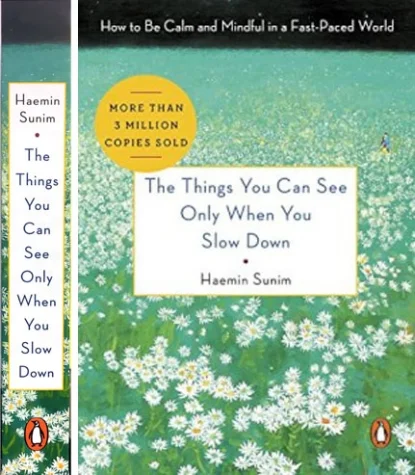
The Things You Can See When You Slow down
Cover design by Roseanne Serra
The message was the title of this book, The Things You Can See Only When You Slow Down. This book is a gifty paper over board trim, with a simple and colorful cover. The author Haemin Sunim is a Korean Zen Monk. His tone is less dogma and more casual quiet good advice. I actually bought this book. Aside from the happy and non religious imagery, what attracted me most to this design was the spine, which shows designer Roseanne Serra's grasp of the message of the book. The stacked title, makes you slow down to read it one word at a time. A brilliant and subtle design decision that made me smile as I paid my money at the register.
Do One Thing Everyday That Centers You
Cover design by Danielle Deschenes
This book is also a gift trim and you have to see it in person to appreciate Danielle Deschenes's design. I used to work with Danielle, she's a dedicated designer with an eye for details. So it's not surprising that what impressed me about this minimal design was her attention to detail. What you can't see here is that the dark letters are dark foil. So sometimes when you shift the book in your hand, the only word that's stands out is the word in white. It's like a code that says what's important is to center, not how.
The Tao of Wu
Cover design by Andrea Ho
This one, I am adding because knowing how to evolve is at the center of both taking care of yourself and continuing to grow creatively. Some of us use faith and philosophy to deal with the bad, tough, and material hurdles life puts in our way. Because some of us have harder roads to finding balance than others, we have to be open to hearing advice on wisdom from many sources. How do you take the hard learned life of a Wu Tang's The RZA and make a respectful yet recognizable jacket that shows how much he overcame? Andrea Ho did it by making a simple shape and respectful type. It's extremely tasteful, yet as bold as the Wu Tang Clan.
PS. You can see more of my favorite covers on my Book Design Heroines Pinterest collection. visit it here.


