Outliers (so wrong it’s right)
Sometimes books can feel like a cozy place we come back to for the comfort they provide. There are books people read because they can predict what’s going to happen. Like B movies, they’re just a fun break from reality, where nothing really unexpected happens. And sometimes we need that noir novel, or easy thriller to get us through the day.
But if you are an avid reader with a modest amount of insight you quickly learn to predict where the plot of the latest hyped book is going, and well once that happens, the book will be left half read somewhere in your home, never to be thought of again. If it’s a book that’s started out well, you may even come up with a better ending than the one written. Your ending will most likely be more. . . imaginative and possibly humorous.
My go-to example is about fiction. But I think it’s probably even more disappointing in non-fiction. Because well, non-fiction writers are great researchers (an admirable trait that is beyond most of us), so if we’ve heard their conclusions or sources before, the book may read like a book report, rather than a new contribution to their chosen field.
Cover design does not always reinvent the wheel either. And sometimes that’s appropriate. Some books are meant to tap into what we already know is true. A good example is glamorous covers about grand subjects (aka success, the human-spirit, beautiful places, fashion, love, etc.) These books by their nature feel like the kind of books that should illustrate the known, rather than add a new dimension to the subject.
This post is not about those book covers. This post is about the books that are unexpected. Funny, witty, and (my personal favorite) thumb their nose at a genre. Sometimes these covers take off, sell an obscene amount of copies, sometimes they don’t. But as visual outliers, they are in some ways above or off the curve. They can only be measured by their cleverness and compared with other clever covers.
If they sell or win awards they raise the bar. They’re that high tide that raises all boats, bless ’em. If they are unsuccessful, they serve to educate a generation of designers about what’s possible, and what’s on the horizon. Bless ’em, again. The value of outliers is hard to measure. But they nevertheless remind readers to pay attention, because new things do happen, even in bookstores.
Here are some of my favorite outlier covers in seemingly classic categories.
Jaya Miceli is kind of a master of snarky funny nose-thumbing covers. It was hard to narrow it down to one. And this time it’s:
The Penguin Book of Gaslight Crime
Illustration by Jaya Miceli
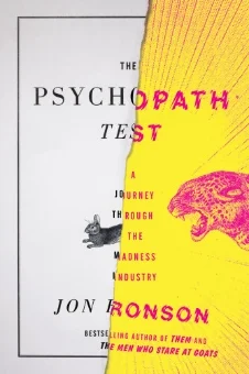
Really mold breaking and just a really exciting non-fiction jacket. It’s Typographically masterful.
The Psychopath Test
jacket design by Matt Dorfman,
art direction by Helen Yentus
This cover has a intensity that’s not normally found in YA fiction. This jacket is awesome in person. The de-embossing of the filled answer bubbles, really sells the idea.
The Taker
jacket design by Elizabeth H. Clark
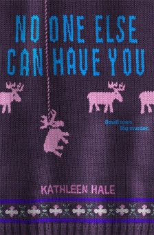
Another intense design. Dark humor that thumbs it's nose at everyone's favorite, the holiday sweater. This is a personal favorite (insert evil laughter).
No One Else Can Have You
design by Michelle Taormina


