Getting Away With Murder: design crimes so bad with results that are so good
What nobody realizes about cover design is that there are RULES. That’s right RULES, big caps (or uppercase, for the typography nerds in the room).
I’m not saying that people look over your shoulder as you work. Most cover designers have a lot of freedom while they come up with ideas, while they design options, and while they work out ideas for each assignment.
But we do get input on our ideas, from art directors, editors, and eventually marketing and sales teams. These folks are professionals, all of them. And these professionals look at hundreds of books every year. They know what’s selling, has sold, is a classic, or was a surprise hit. And this means some of the RULES are based on past results.
Fortunately, the past can’t give you fool proof predictions of the future. And that’s good news otherwise all our covers would look identical year after year. Publishing people know you can’t just do the same things over and over again, even though it’s tempting. Readers embrace things today and quickly move on tomorrow.
Through the feedback process, the RULES are often brought up. I won’t bore you with all of them, because that would be an insanely long blog post. I’ll stick with 3 of them (in no particular order, with examples.)
RULE #1: Don’t break up the title or the author's name (or the readers will never figure it out)
Anna Green actually breaks up the title of Secrecy, so she can crop it and therefore imply obscuration. Pretty smart solution and definitely a rule breaking cover.
Secrecy
jacket design by Anna Green
Ciara Elliot's crow takes a bite out of the Margaret Atwood's name. Which helps to remind the reader that Stone Matress is an ominous story collection.
Stone Mattress
cover design by Ceara Elliot
RULE #2: Blue is for men, Pink is women:
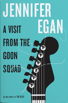
Yes, men love blue, but so do women who read Jennifer Egan. This book cover inspired so many articles and blog posts about how “women’s” book covers are too gender specific. The book is awesome, so maybe blue is just a good color for good writers. Another reason this is so refreshing is that pink and black are the classic "punk(y)-music" cover colors, so it's very cool that this cover didn't go that way.
A Visit from The Goon Squad
jacket design by Barbara de Wilde
RULE #3: San serif typefaces are boring and stern, not friendly or fun:
Full disclosure. I love sans serif, and a good designer can make san-serif fun, friendly, mean, neurotic, etc. Also, if the image is wild, balancing it with a “cool” san-serif face, may keep the cover from going too cartoon-y.
Emily Mahon has created some excellent examples of fun san serif covers. The Vanishers is a good example of how san serif faces can create balance for wild covers.
And Emily's cover for The Ghost in the Electric Blue Suit makes the sans title the fun part of the cover. The alternating happier colors of the title set off the atmospheric gray and lonely landscape of the cover.
The Ghost in the Electric Blue Suit
Jacket design by Emily Mahon
PS. You can see more of my favorite covers on my Book Design Heroines Pinterest collection. visit it here.


